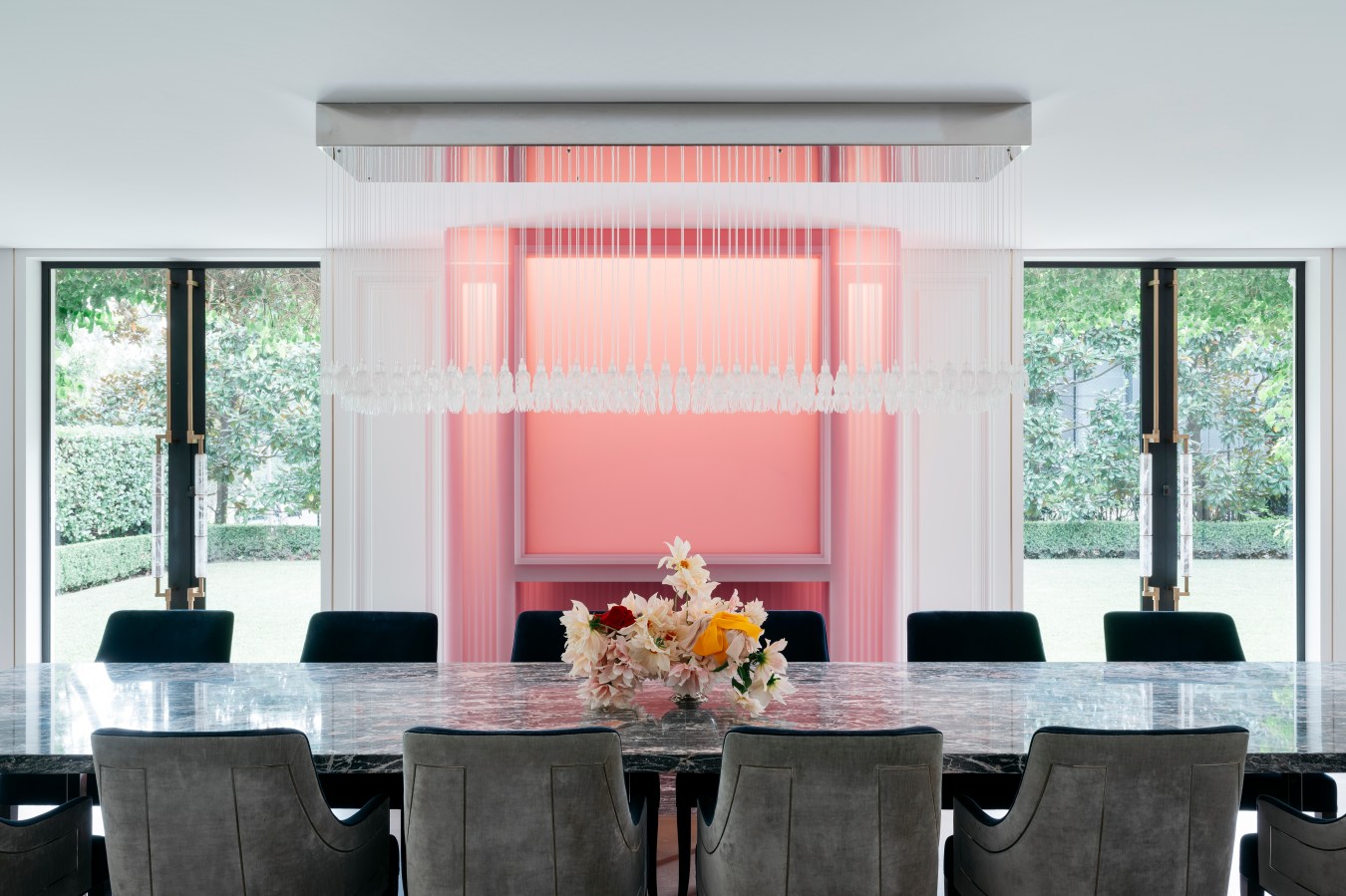
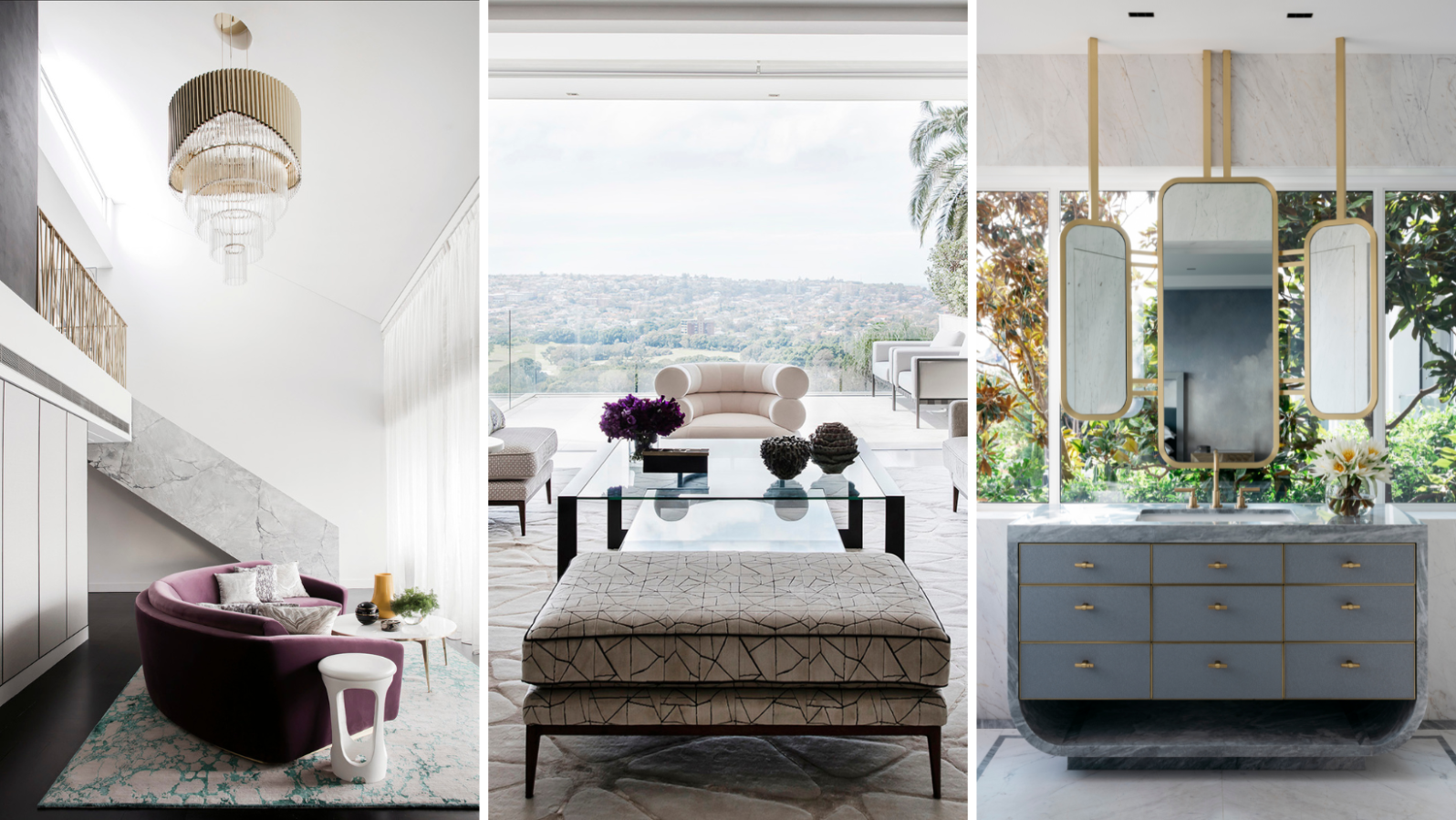
Daniel Goldberg made his mark designing the apartments in London’s divisive The Shard. Soon after, the German won the job of One Sydney Harbour. His State of Craft studio is now designing the apartments at Lendlease’s One Circular Quay, which will rise 58 storeys above Sydney Cove and which has already presold more than $1 billion of prime real estate.
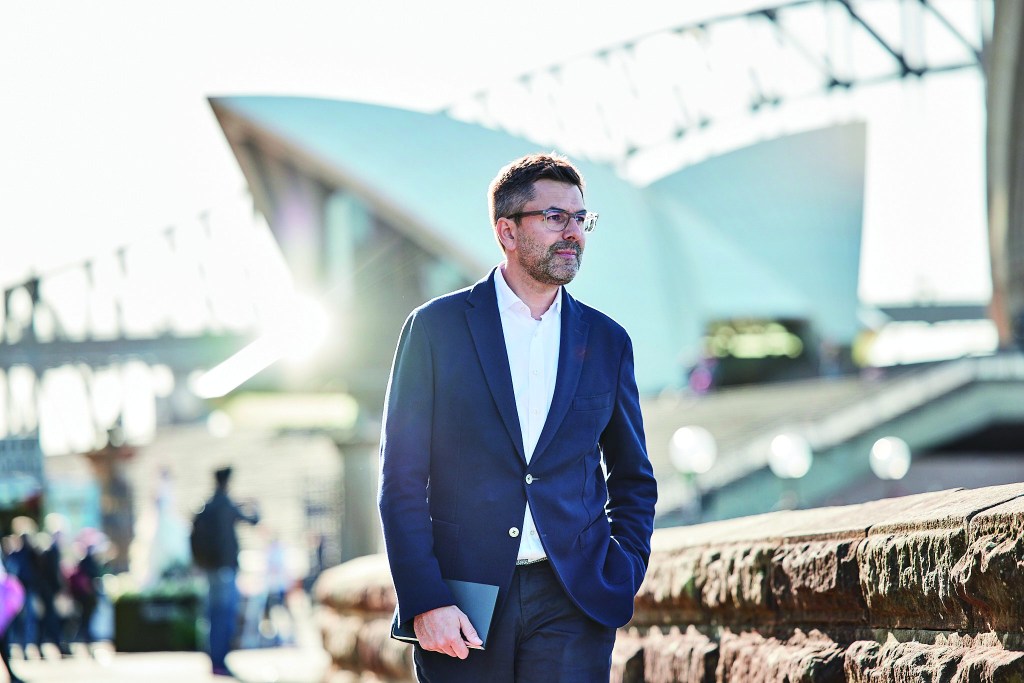
So how did a German based in London come to design One Circular Quay, a site wedged between the Sydney Opera House and the Harbour Bridge?
Renzo Piano was the common link. A delegation from Lendlease toured the world looking for an interior designer to partner with them [on the Renzo Piano-designed One Sydney Harbour at Barangaroo], and I showed them around the ten very exclusive apartments we designed at the top of the [Renzo Piano-designed] Shard, 300 metres above London. There’s nothing like it in Europe. They liked it, and soon after, we were signed up. That really started that whole collaboration with Lendlease.
Do you work differently designing an apartment 300 metres above London as opposed to Sydney?
There’s a lot of common ground. These tall buildings have full-glazed facades, maximising the view and the light but also managing the light so that it’s not too much glare. That’s something we’ve learnt in The Shard. What’s the right way of living high above the city and still feeling connected to the outside? That’s helped us a lot in hitting the ground running with One Circular Quay and One Sydney Harbour.
An example?
When you’re looking out at night, and you’ve got low-iron glass coming to the floor, there’s a sense of visual continuity from inside to outside. We selected a very dark polished oak floor at The Shard. That dark flooring doesn’t reflect in the glass. It’s similar to the dashboard in a car. These dark absorptive surfaces don’t reflect, so your eye can travel through the glass. It makes the glass façade almost disappear at night. The water at night appears black and reflects the city lights. That quality of reflectivity and darkness are transported into the interiors.

That approach works well in The Shard. So, we developed three palettes for One Circular Quay purchasers to choose from. One is very light and pale, and at the other end is this much darker palette which shares some of the qualities we established in The Shard. The third palette is richer. We bring in Australian timber and dark-green marbles. Each of those palettes picks up on a specific aspect of the context. We looked for inspiration just outside the front door of Sydney Harbour.
Are you chasing the light in London, whereas in Australia, you might be hiding from it?
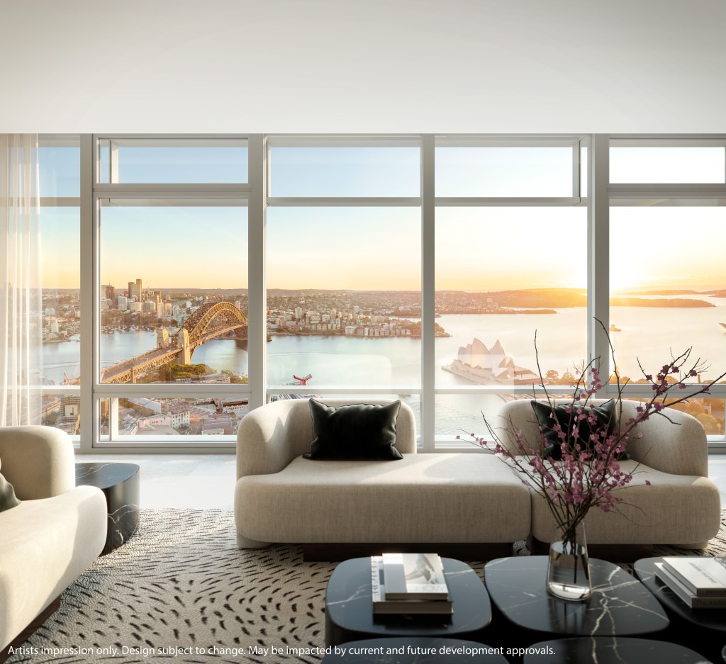
The sun is more intense in Sydney, but in The Shard you’ve got “lighthouse living”. Every apartment has at least one whole floor. You’ve got floor to-ceiling glazing all the way around, so you can follow the sun as the day progresses. You get up in the morning, and the kitchen is oriented to the east, so you can enjoy the sunrise over the Thames, looking down onto Tower Bridge. In the evening, you’ve got Westminster and the warm glow. It’s different at One Circular Quay unless you go to the very top. The penthouses have wonderful 360-degree views, but further down in the building, there is more of a north-south aspect. We’re still working through how we work the top apartments. Yes, there’s the sun path, but overlapping is the desire to optimise the dominance of Circular Quay and the framing of the Opera House and the bridge. It’s such an incredible triangle.
The Quay itself is a stage. It’s always moving and changing. Sometimes, it’s dark and foreboding, and sometimes sparkling and bright. You’ve got the ferries darting about, cruise liners docking, and sailing races. You’re in the front-row seat of a theatre. We reconfigured a large master suite where we created a series of three connected spaces – the sleeping area, the robe area and then the bathroom furthest away from the facade. But we connected it all with large sliding doors that you can open so there’s a real sense of continuity, spatially, and the very long panoramic mirror is directly opposite, so even if you’re brushing your teeth, you’ve got the Harbour Bridge directly in view reflected in the mirror. It’s about thinking through all those viewing angles.
How does it change your thinking when you don’t know who will occupy the apartment?
Sometimes, it’s about allowing for flexibility. We were conscious that our work was just part of creating a home. There’s the whole layer of soft furnishings and artworks and tables and chairs and rugs that they will bring to it. It’s important to not over-design walls. Leave walls simple so people can put their furniture in front of it or put their art on it, as opposed to having lots of feature walls.
But some are looking for a curated experience. They want to buy into the whole brand. They’re expecting spaces to be beautifully detailed and considered. When I first worked on multi-unit apartments 15 years ago in London, there was still the thinking that you are defining a purchaser profile. But increasingly that has become a slippery slope. You can’t say any more that it’s going to be a male lawyer or a banker in his 50s. There are so many people with a surprising amount of wealth to buy these really expensive apartments. You’ve got to design interiors that are not trendy. You use beautiful natural materials and put them together with honesty and craftsmanship. People will value that.
